Websites designed with clear structure, solid details, and a strong visual identity.
Introduction
We design digital experiences that look distinctive, feel intuitive, and move with purpose. Blending thoughtful web design with expressive motion, we create memorable websites that bring brands to life and leave a lasting impression.
Healthcare Website
Environment
Websites / Desktop / Mobile
Purpose
Service Navigation / Specialist Discovery / Appointment Booking
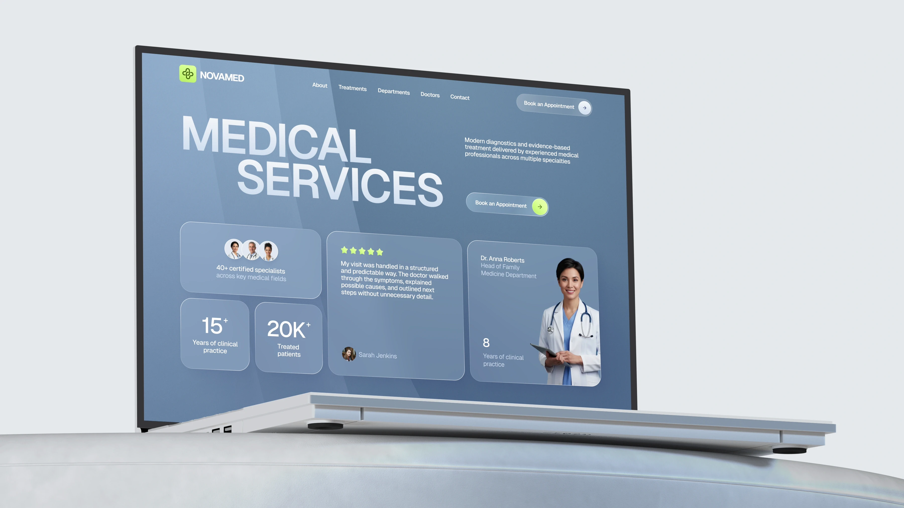
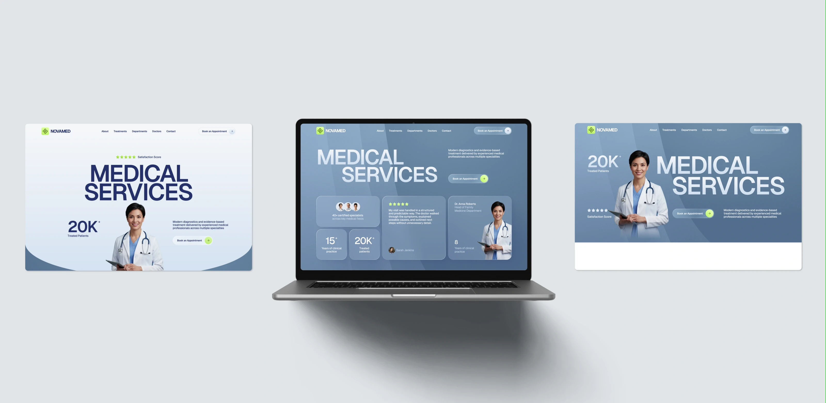
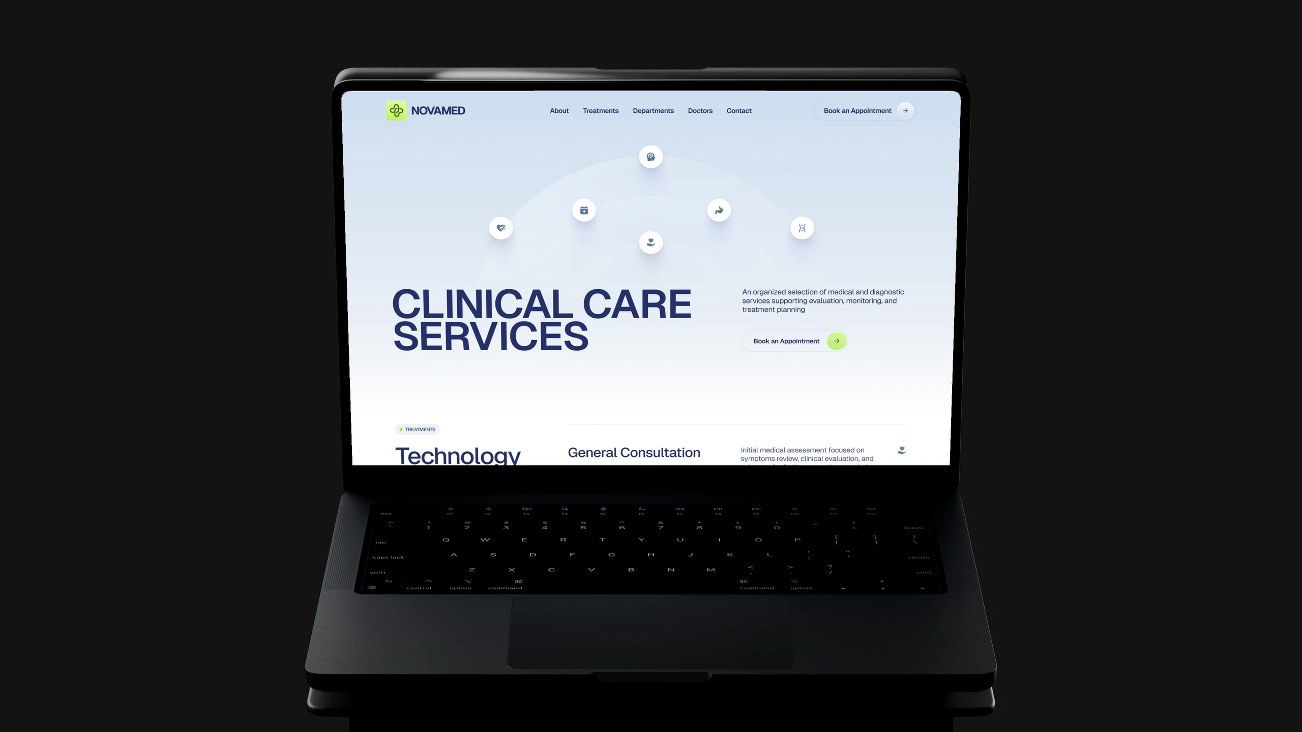
For the homepage, we explored three different visual directions, giving the client a range of approaches to choose from. Each version used the same core content, but explored a different layout, composition, and visual balance.
Motion in the details
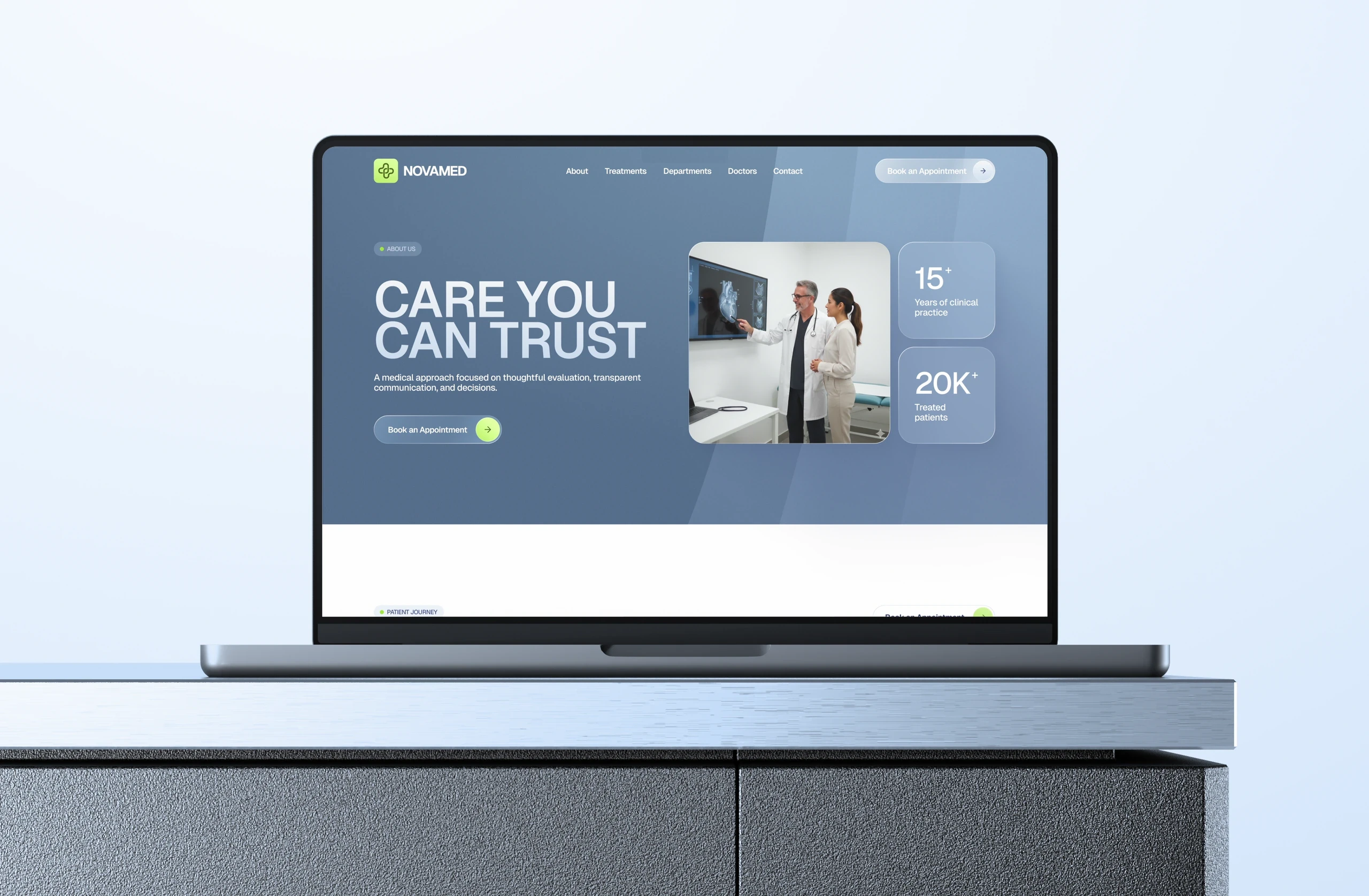
Every page was designed to feel consistent and easy to follow, helping the website stay clear even when presenting a large amount of information.
Beyond the interface
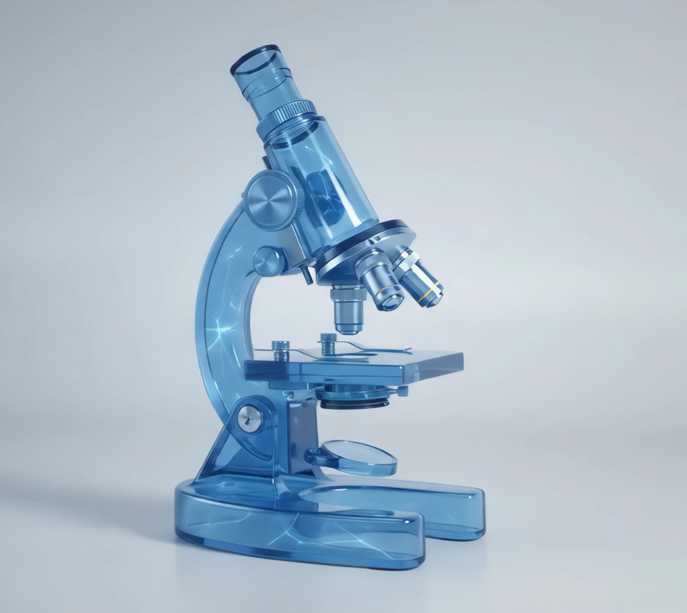
Alongside the interface, we developed a series of custom 3D icons around key medical themes, with motion added to selected pieces to make the visuals feel more lively and memorable.

Each icon is tied to a specific medical department, giving every card a clear visual reference and making the categories easier to distinguish at a glance.
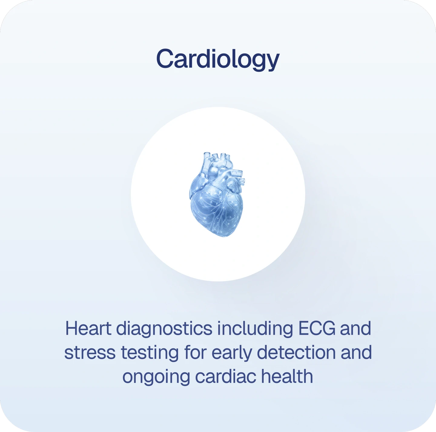


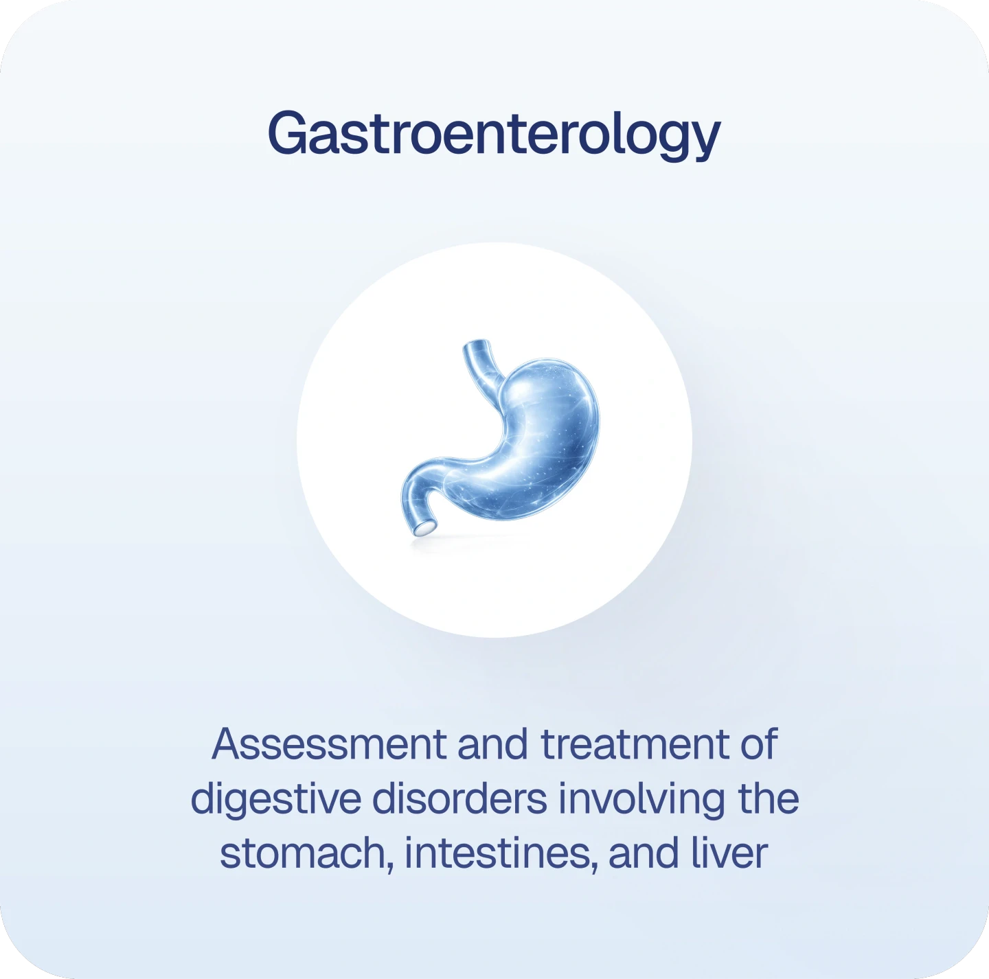

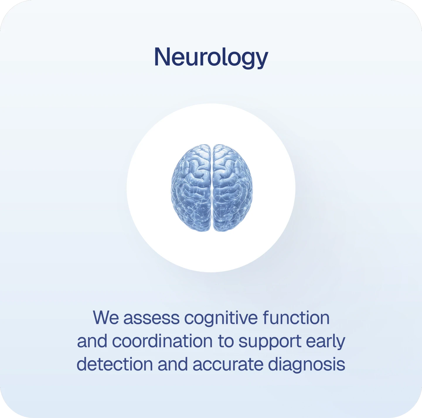
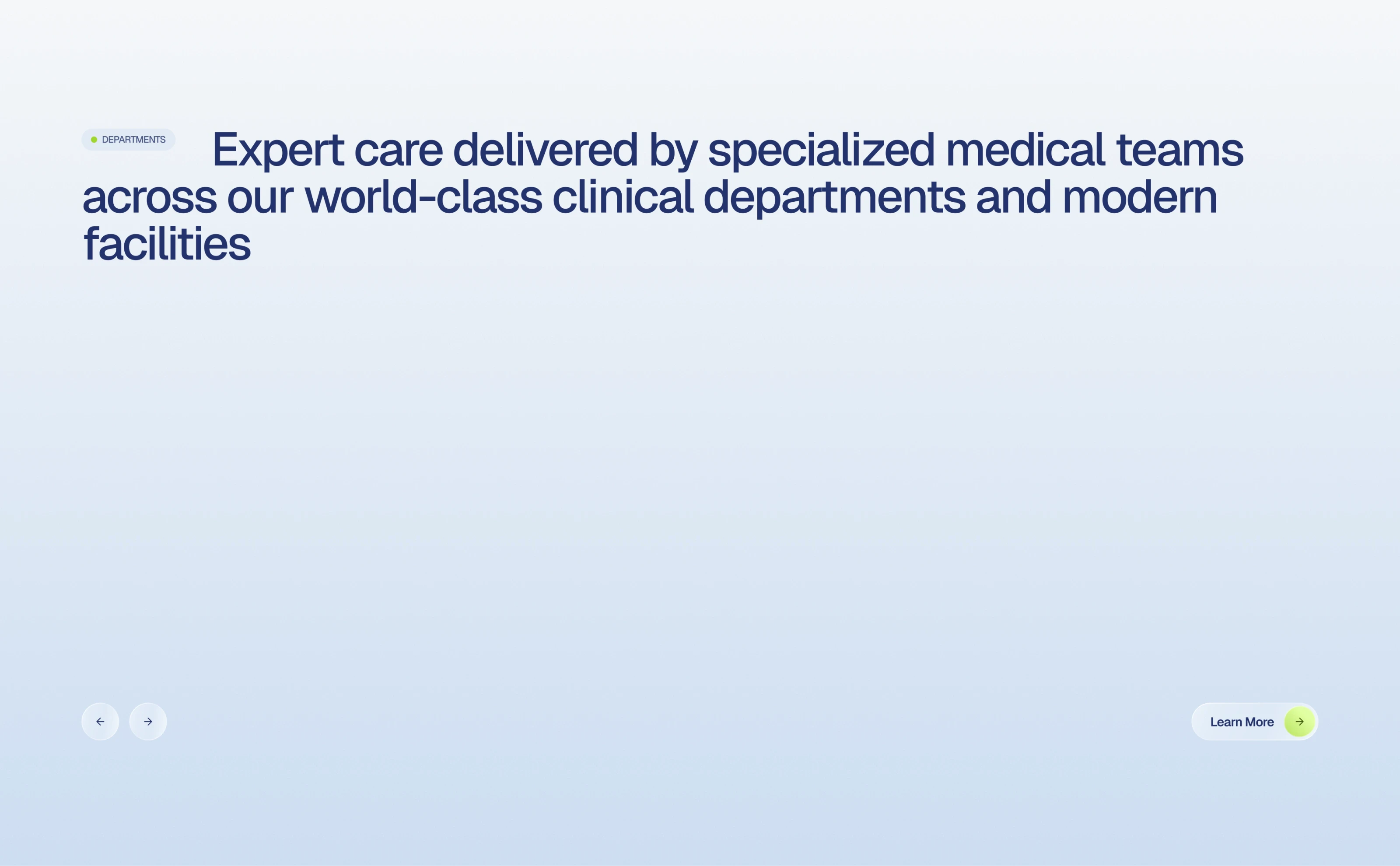
We explored several variations of the department section, using the custom 3D icon set as a consistent visual element across different layouts.
Bringing it all together
Rather than using the 3D icons in the same way everywhere, we adapted them to the needs of each page. From compact card visuals to larger compositions integrated into the layout.
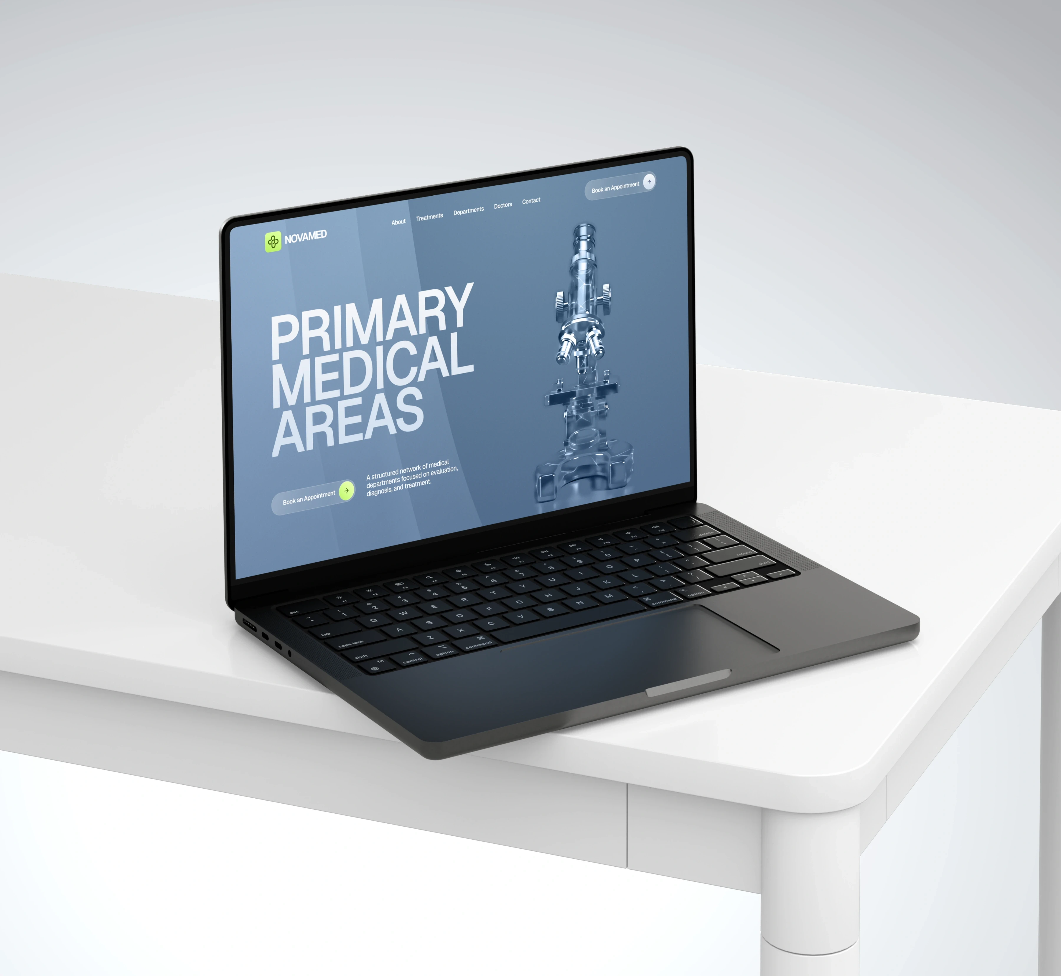
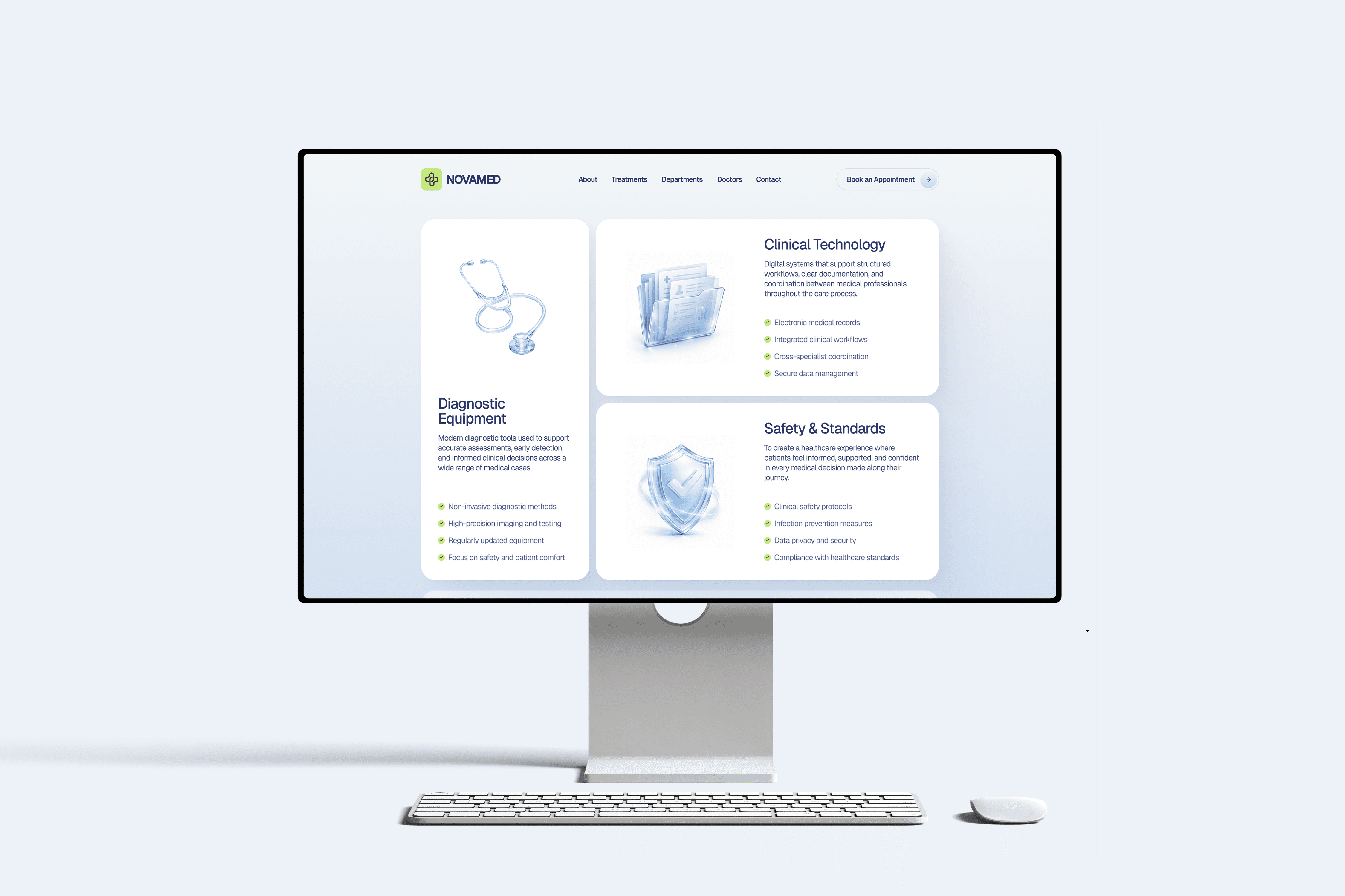

We paid close attention to how information is grouped and prioritized, so users can quickly understand what each page offers and find the details that matter to them.
Healthcare Platform
Environment
Healthcare SaaS / Responsive Web
Purpose
Service Navigation / Specialist Discovery / Appointment Booking
For this healthcare platform, we redesigned the homepage as part of a project brought to us by Webyst. The goal was to focus on clearer navigation and stronger content hierarchy while meeting WCAG 2.2 requirements and preserving the existing visual identity.
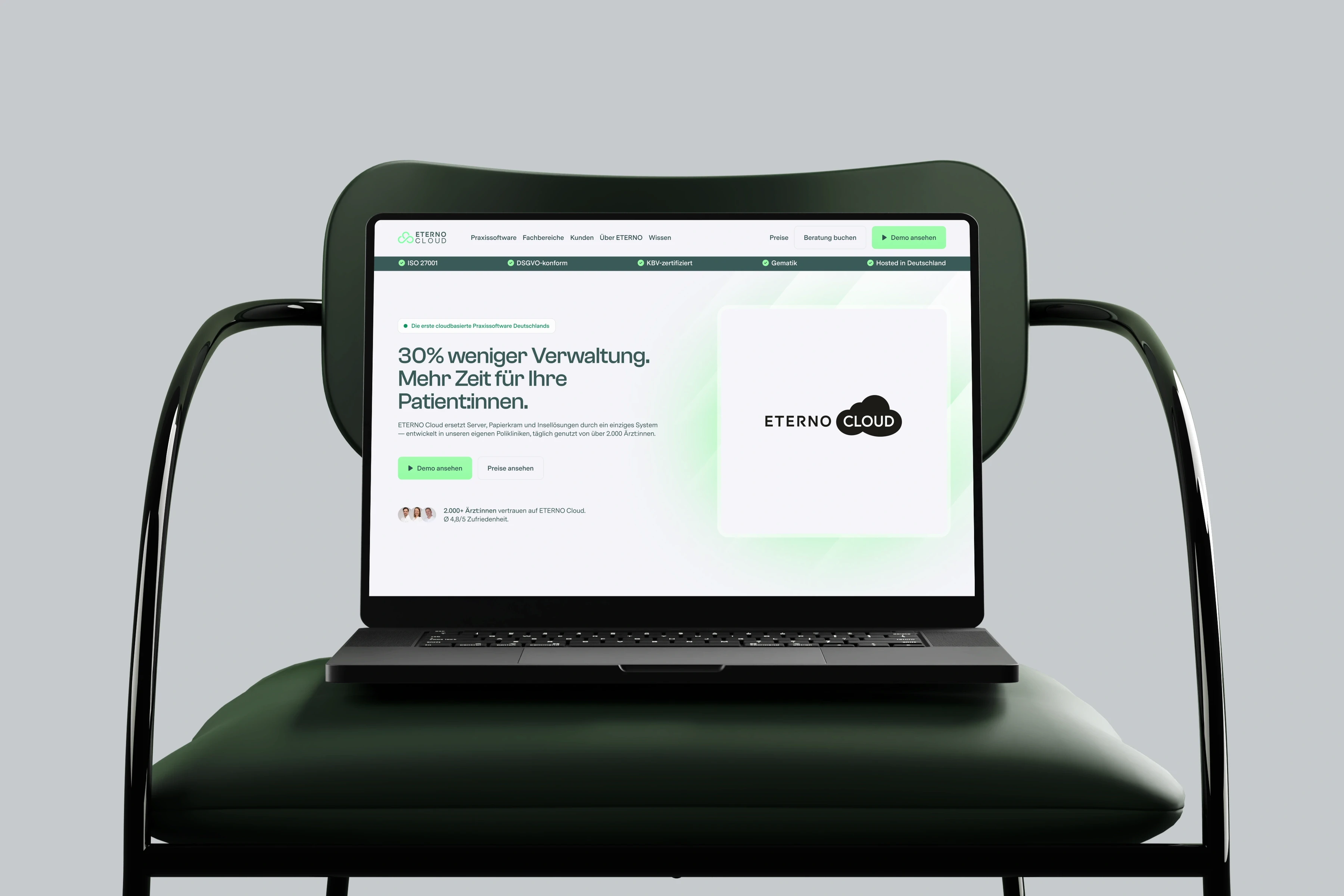
More than a redesign
Alongside the homepage redesign, we created a separate set of animated visuals to support selected moments across the website and add more movement where it made sense.